The stock market (S&P 500) has risen over 6% in the two months since the US election, with sectors like Financials, Energy, Industrials and Materials rising even more. Impressive as the bullish move has been, almost all of it occurred in the four weeks immediately following the election; the widely followed US indices are essentially unchanged over the last four weeks.
While we've discussed the post-election sector leadership and possible implications for future moves, it's also worth looking at another aspect of "market internals" -- breadth. For the uninitiated, market breadth simply seeks to quantify the number of stocks showing bullish and bearish characteristics.
In general, breadth can provide a leading indicator for the indices. If an index is rising but showing deteriorating breadth, it suggests that the rally is being driven by just a few -- likely large cap or highly priced -- stocks, which generally means it is more vulnerable to a downturn. Conversely, a falling market with improving breadth is often a precursor to a significant bottom, as it shows that the "market of stocks" is improving.
In a way, you can think of market breadth like a runner's "breath". The runner showing labored breathing, even if she's not yet slowing down, is more likely to drop off than one who has a healthy breathing pattern.
Two Ways To Gauge Breadth
There are two primary ways to measure breadth. The first is through a cumulative advance-decline line. Much as the name suggests, this indicator simply adds the number of rising stocks and subtracts the number of falling stocks from a running total. The actual value of the indicator isn't particularly meaningful, but the trend in an advance-decline line provides valuable insight into the level of support for the market as a whole. The other major way to measure breadth is to look at the number of stocks above or below a major moving average as a proxy for what percentage of an index's underlying constituents are trending higher or lower.
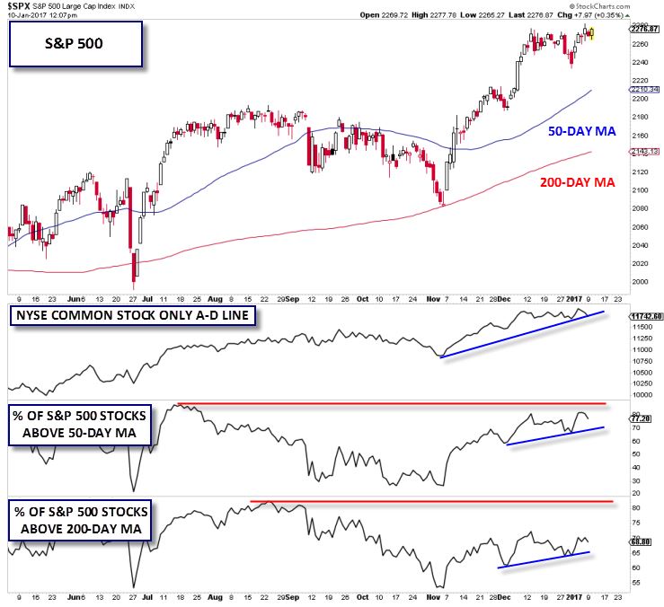
The chart below highlights the NYSE Common Stock Only Advance-Decline Line, the % of S&P 500 stocks above their 50-day MA, and the % of S&P 500 above their 200-day MA:

Source: Stockcharts.com
As the chart shows, the broad advance-decline line is relatively bullish. The measure reached an all-time high just last week and remains in a clear uptrend from the election lows. However, the outlook based on the other two breadth indicators is a bit mixed. While the % of S&P 500 stocks trading above their 50- and 200-day moving averages are both trending higher in the near term, they are still well below the peaks set late last summer.
Watch The 50 DMA
For the timeframes we trade, the % of stocks above the 50-day MA is most relevant. Taking a step back, the fact that nearly 80% of S&P 500 stocks are trading in an "uptrend" (above their 50-day MA) is still a bullish signal. That said, if this measure rolls over to break below the December low, especially if accompanied by weakness in other breadth indicators, it would signal that the S&P 500 is due for a pullback, regardless of what the incoming president has up his sleeve.
